Goal
Create a white-label application that would allow small banks to have a modern app in a short time.
Create a white-label application that would allow small banks to have a modern app in a short time.
Product Designer
Approximately 1 year and 3 months
3 product designers + 1 design system designer
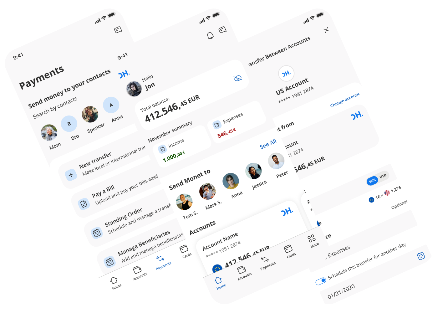
One of the main challenges was designing a competitive application that could measure up against established apps from large European banks.
To achieve this, we conducted extensive benchmarking and prioritized critical features, ensuring the solution met usability, security, and scalability standards.
It was also key to validate that the solution addressed the real needs of end users.
To that end, we carried out interviews and testing with clients, which helped us refine flows and identify improvements early on.
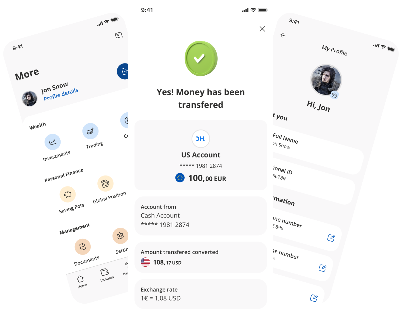
During research, we found that users perceived the banking sector as too formal, rigid, and distant. We decided to take a more approachable and human visual and communication tone, differentiating ourselves from direct competitors.
This translated into the use of illustrations, microcopy, and visual resources that added freshness to the experience without losing credibility or rigor.
As a result, we created an app that was more accessible and appealing to a diverse audience.
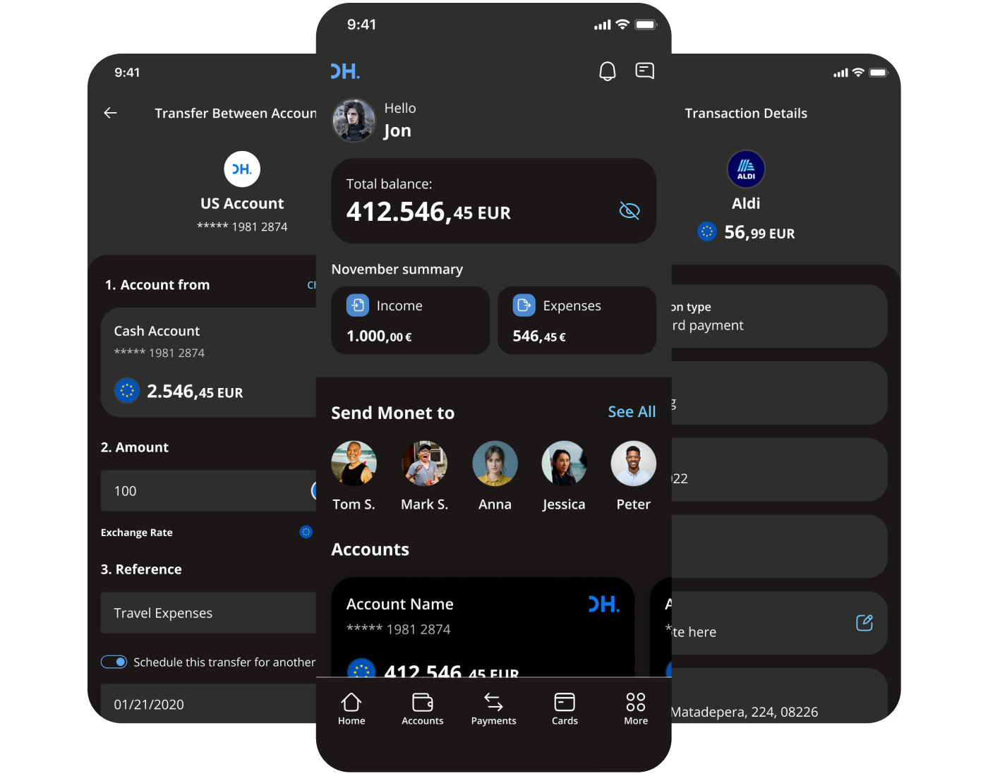
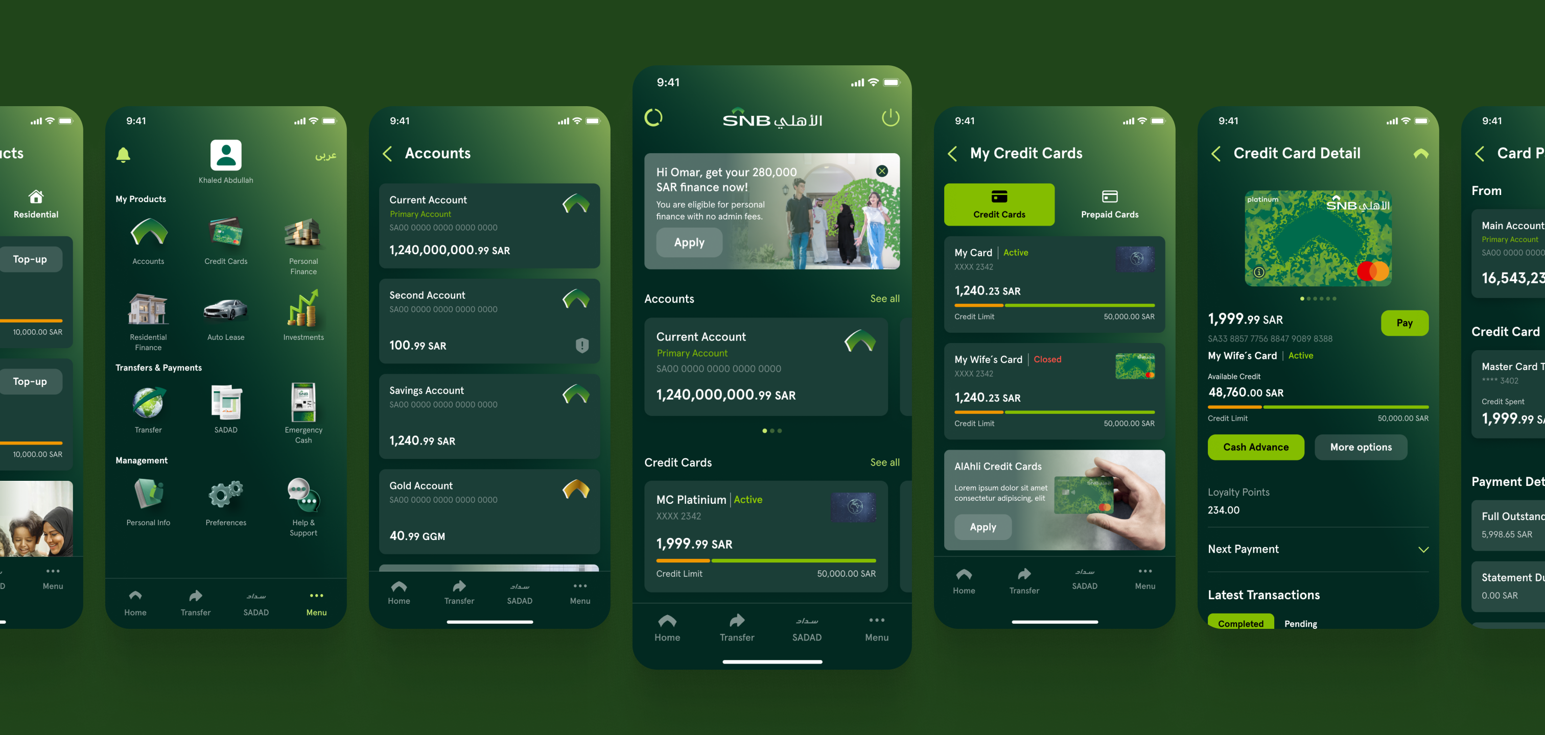
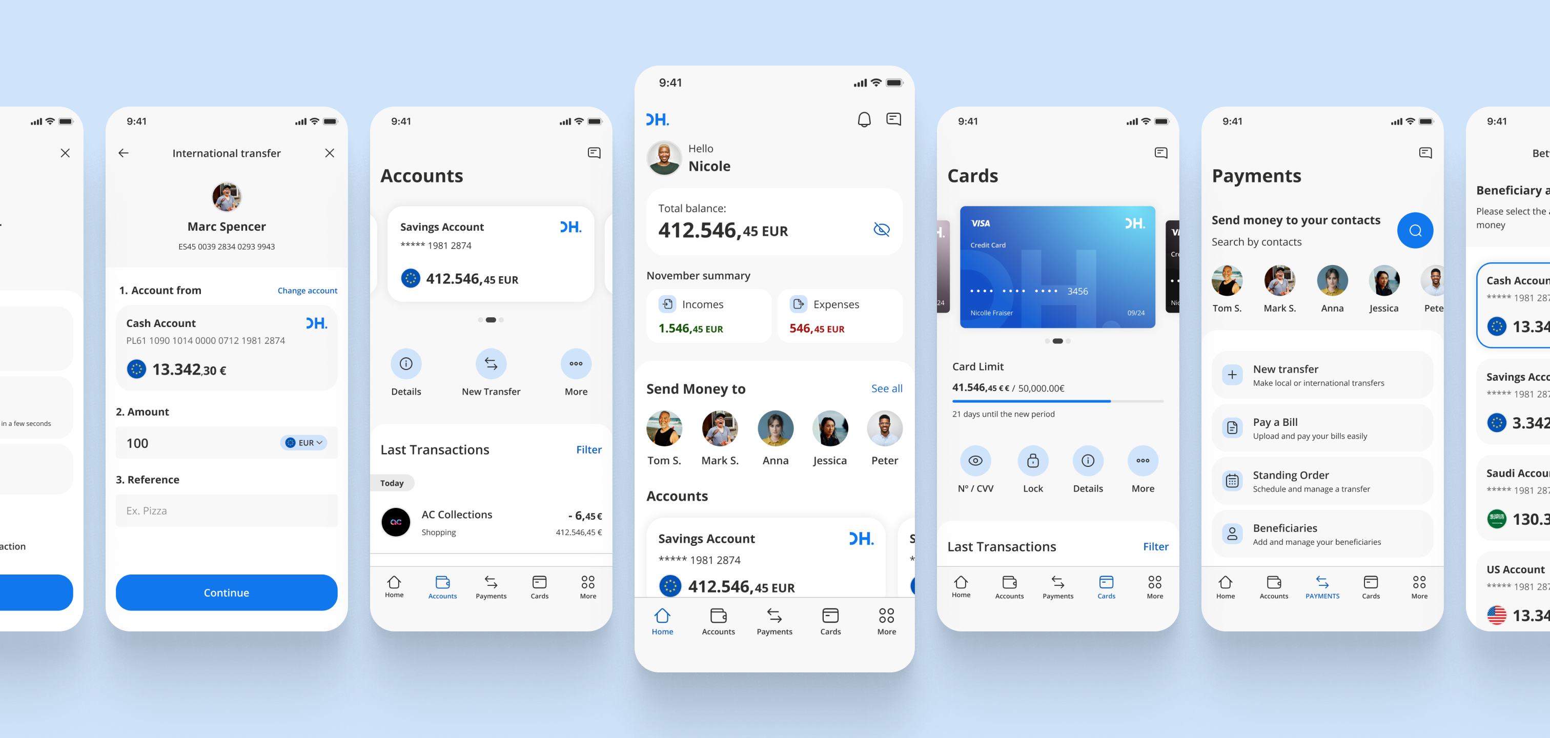
The greatest value of a white-label app is its ability to adapt to different banks without compromising the quality of the experience.
That’s why we designed a flexible system with parameterizable components and flows that could easily adapt to different contexts.
This not only ensured visual consistency but also simplified implementation and technical integration.
The idea was that each bank could customize the application according to its specific needs, without compromising the user experience or duplicating design efforts.