Goal
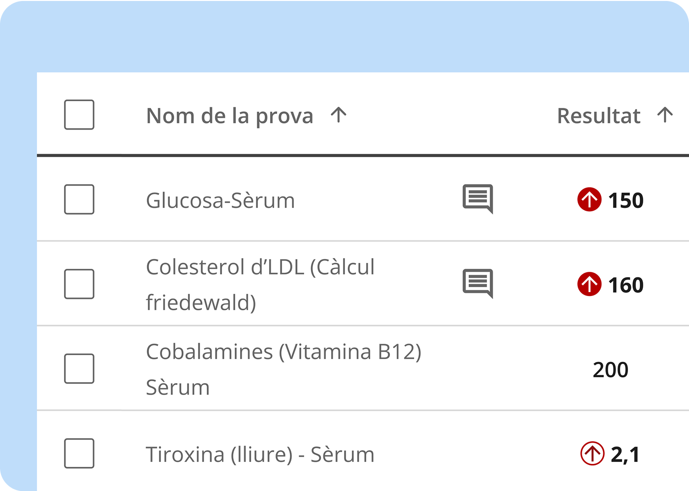
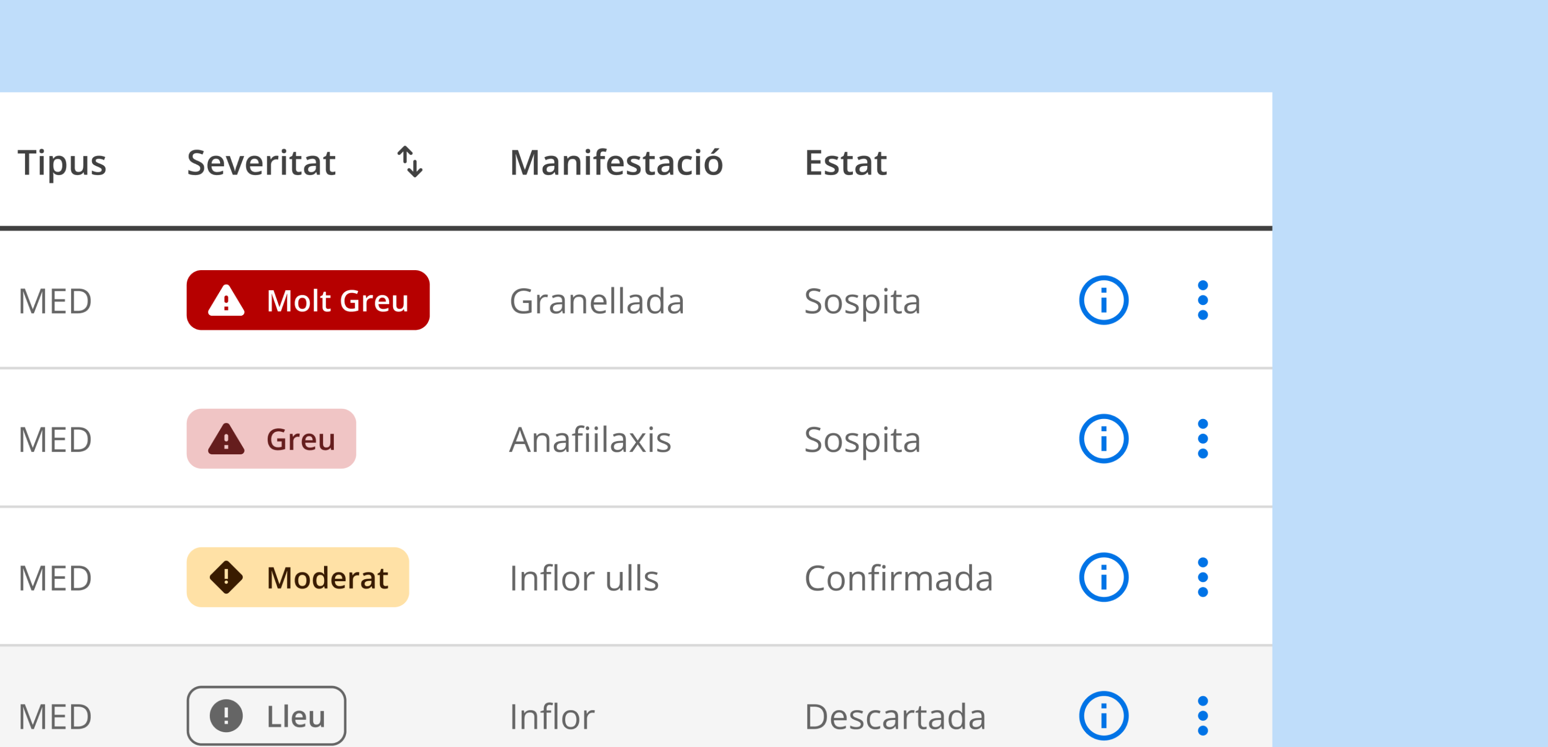
Define a system of visual indicators —status, informational, and criticality— to improve understanding and ensure consistency in medical applications used by healthcare professionals.
Define a system of visual indicators —status, informational, and criticality— to improve understanding and ensure consistency in medical applications used by healthcare professionals.
Design System Lead
Approximately 2 months.
Design System Lead
It was essential for the indicators to be understandable even in stressful situations or with visual limitations.
We worked on contrast, visual redundancy (color + iconography), and minimum sizes to ensure readability.
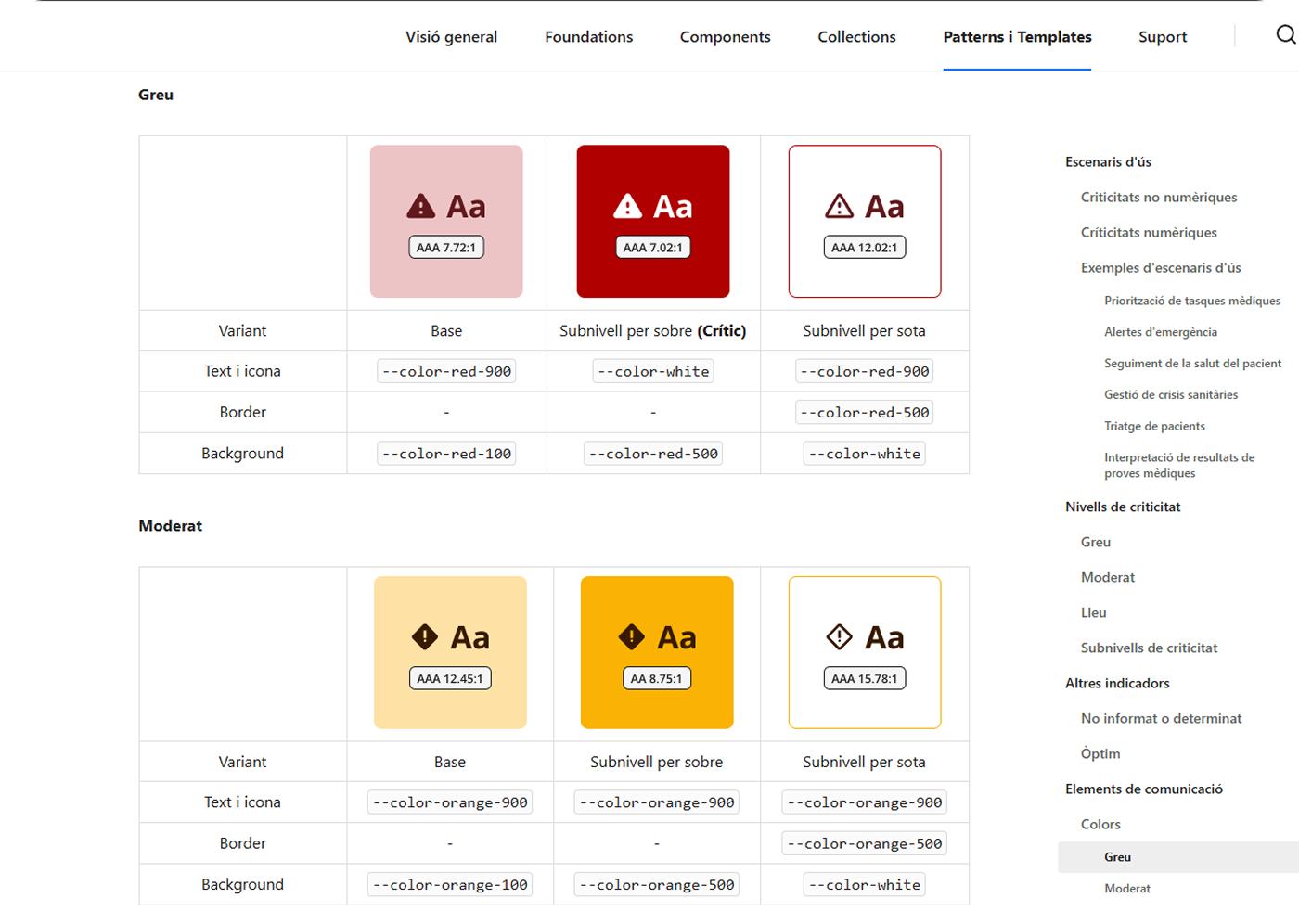
Stakeholders had been using previous systems for more than 10 or 20 years, which created a strong bias toward what they already knew.
The challenge was finding a balance between introducing a more modern system and maintaining a reasonable learning curve.
To validate that the indicators conveyed the correct information and reduced ambiguity, we conducted usability tests with doctors. The results allowed us to adjust colors, iconography, and nomenclature until we achieved a reliable and easily interpretable system.